GE03final_Koplow
Eva Koplow
2/20/2019
library(tidyverse)## ── Attaching packages ───────────────────────────────────────────────────────────────── tidyverse 1.2.1 ──## ✔ ggplot2 3.1.0 ✔ purrr 0.3.0
## ✔ tibble 2.0.1 ✔ dplyr 0.8.0.1
## ✔ tidyr 0.8.2 ✔ stringr 1.4.0
## ✔ readr 1.3.1 ✔ forcats 0.4.0## ── Conflicts ──────────────────────────────────────────────────────────────────── tidyverse_conflicts() ──
## ✖ dplyr::filter() masks stats::filter()
## ✖ dplyr::lag() masks stats::lag()all_states <- map_data("state")##
## Attaching package: 'maps'## The following object is masked from 'package:purrr':
##
## mapcongress <- read_csv("womenincongress.csv")## Warning: Missing column names filled in: 'X1' [1]## Parsed with column specification:
## cols(
## X1 = col_double(),
## state = col_character(),
## senators = col_double(),
## representatives = col_double(),
## total = col_double()
## )names(congress)[2] <- "region"
stateData <- left_join(all_states, congress, by="region")
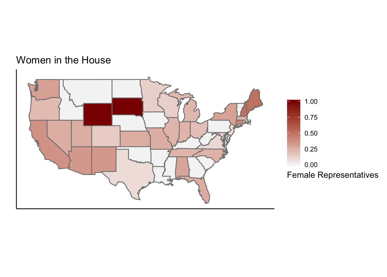
repProp <- ggplot()+geom_polygon(data=stateData,aes(x=long, y=lat, group = group, fill=representatives/total),color="grey50")+coord_map()+labs(x="",y="",title="Women in the House")+theme_classic()+ theme(axis.ticks.y = element_blank(),axis.text.y = element_blank(), axis.ticks.x = element_blank(),axis.text.x = element_blank())
housePlot <- repProp + scale_fill_gradient(name="Female Representatives", low="whitesmoke", high = "darkred", guide = guide_colorbar(title.position = "bottom"))
housePlot
library(tidyverse)
all_states <- map_data("state")
congress <- read_csv("womenincongress.csv")
## Warning: Missing column names filled in: 'X1' [1]## Parsed with column specification:
## cols(
## X1 = col_double(),
## state = col_character(),
## senators = col_double(),
## representatives = col_double(),
## total = col_double()
## )names(congress)[2] <- "region"
stateData <- left_join(all_states, congress, by="region")
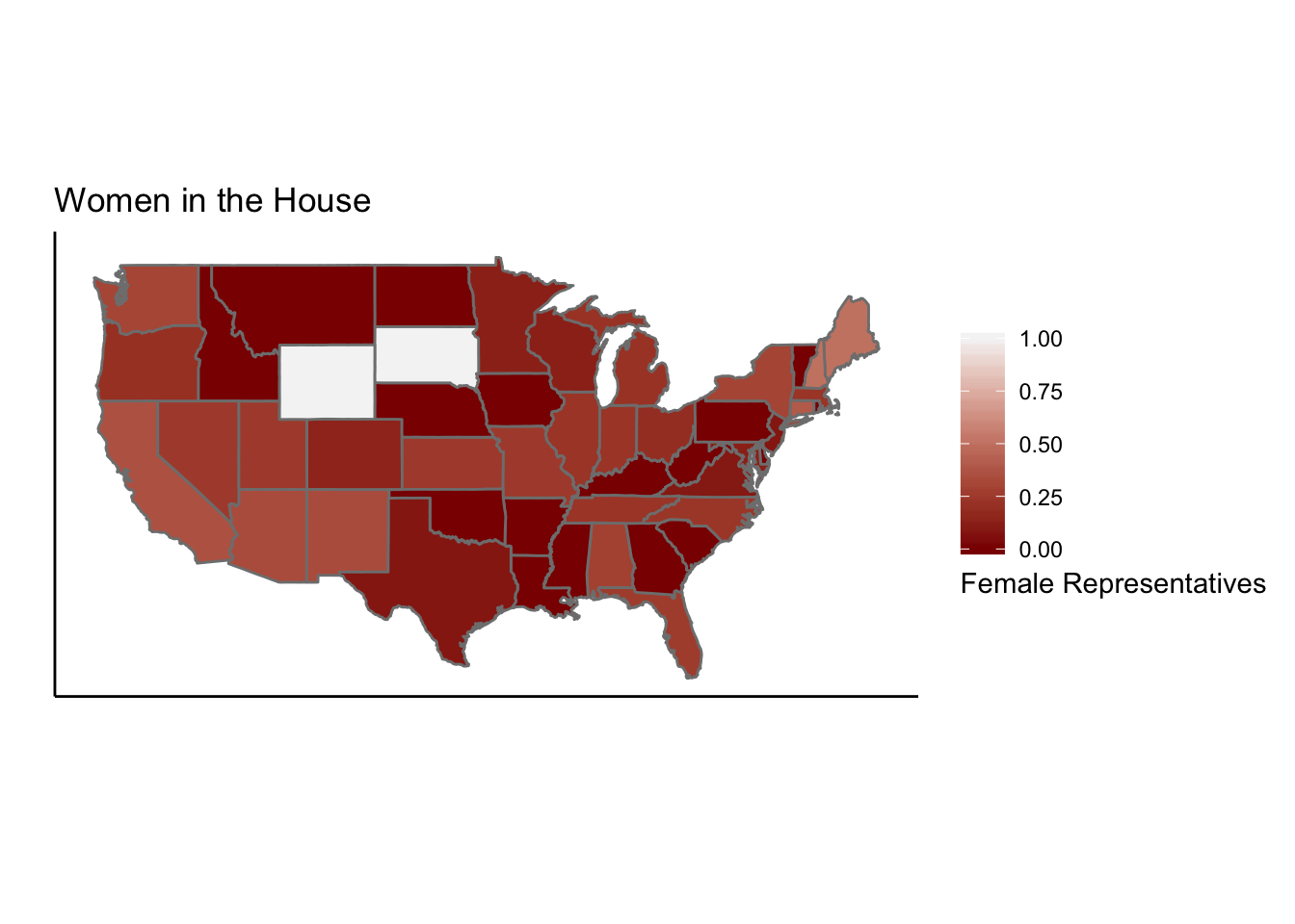
repProp <- ggplot()+geom_polygon(data=stateData,aes(x=long, y=lat, group = group, fill=representatives/total),color="grey50")+coord_map()+labs(x="",y="",title="Women in the House")+theme_classic()+ theme(axis.ticks.y = element_blank(),axis.text.y = element_blank(), axis.ticks.x = element_blank(),axis.text.x = element_blank())
housePlot <- repProp + scale_fill_gradient(name="Female Representatives", low="darkred", high = "whitesmoke", guide = guide_colorbar(title.position = "bottom"))
housePlot
electionData <- read_csv("2012.csv")## Warning: Missing column names filled in: 'X1' [1]## Parsed with column specification:
## cols(
## X1 = col_character(),
## ObamaVotes = col_double(),
## ObamaEV = col_double(),
## RomneyVotes = col_double(),
## RomneyEV = col_double(),
## JohnsonVotes = col_double(),
## JohnsonEV = col_double(),
## SteinVotes = col_double(),
## SteinEV = col_double()
## )names(electionData)[1] <- "region"
electionData$ObamaPerc <- electionData$ObamaVotes/(electionData$ObamaVotes+electionData$RomneyVotes+electionData$JohnsonVotes+electionData$SteinVotes)
electionData$RomneyPerc <- electionData$RomneyVotes/(electionData$ObamaVotes+electionData$RomneyVotes+electionData$JohnsonVotes+electionData$SteinVotes)
electionData <- merge(all_states,electionData,by="region")
South <- filter(electionData, region %in% c("delaware", "florida", "georgia", "maryland", "north carolina", "south carolina", "virginia", "district of columbia", "west virginia", "alabama", "kentucky", "mississippi", "tennessee", "arkansas", "louisiana", "oklahoma", "texas"))
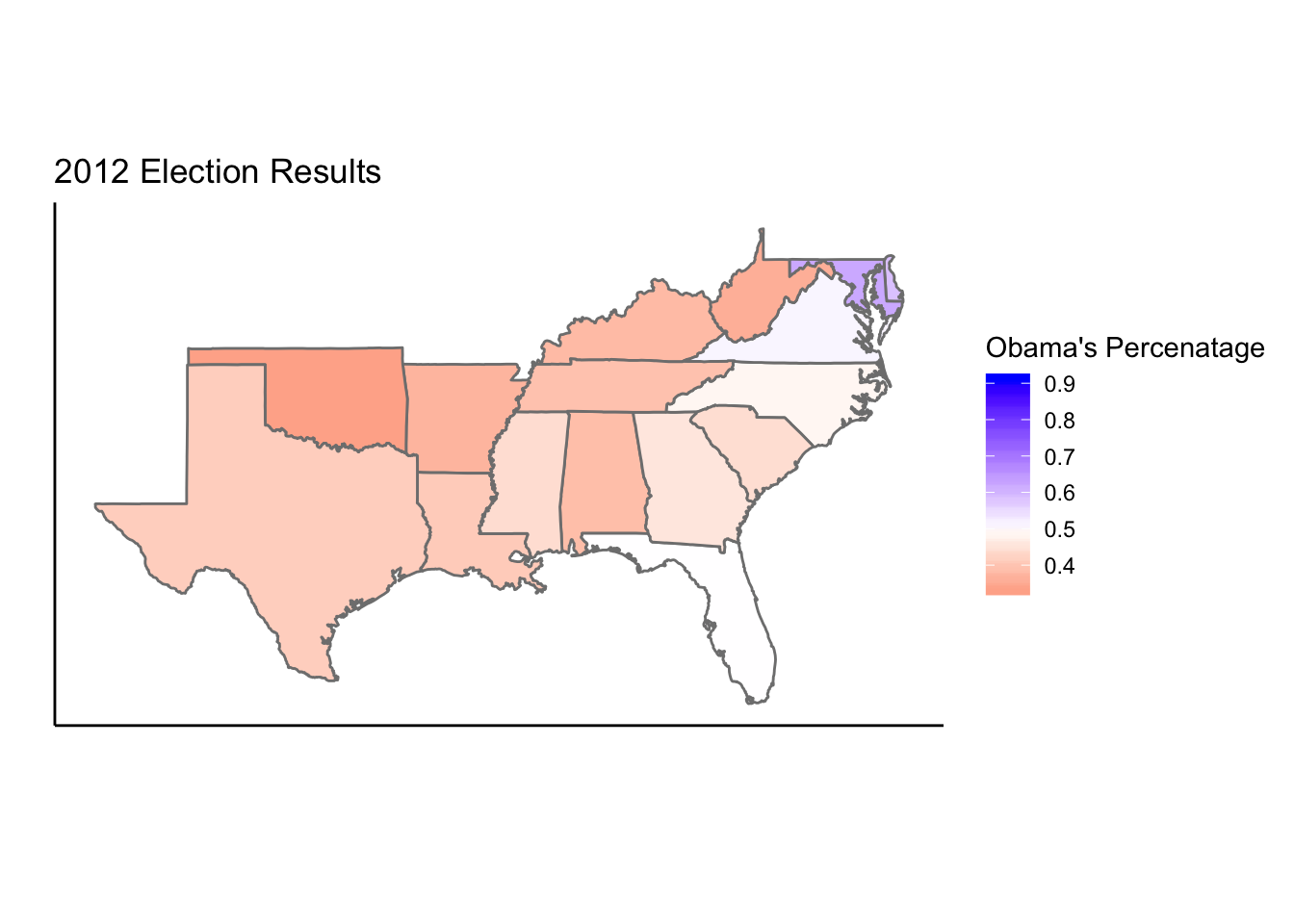
SouthPlot <- ggplot()+geom_polygon(data=South,aes(x=long, y=lat, group = group, fill=ObamaPerc),color="grey50")+coord_map()+labs(x="",y="",title="2012 Election Results")+theme_classic()+ theme(axis.ticks.y = element_blank(),axis.text.y = element_blank(), axis.ticks.x = element_blank(),axis.text.x = element_blank()) + scale_fill_gradient2(name="Obama's Percenatage",low="red",mid="white",high="blue",midpoint=.5)
SouthPlot
The goal of the first two data visualizations is to show the proportion of the house representatives who are women for each state. All the data for these visualizations was from the course and or Wikipedia. The color gradient illustrates this proportion with the scale flipping between the first and second choropleth. From this image it’s clear that Wyoming and South Dakota have the highest proportion of female representatives and many southern states such as Louisiana and Mississippi have the lowest. The third choropleth shows the southern states voting distribution for the 2012 presidential election showing Obama’s percentage of the vote as color scale. It’s clear from this graph that Obama got below 50% of the vote in all southern states except for Maryland and Delaware.