My First Markdown Document
Eva Koplow
January 18, 2019
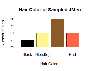
Target Graph

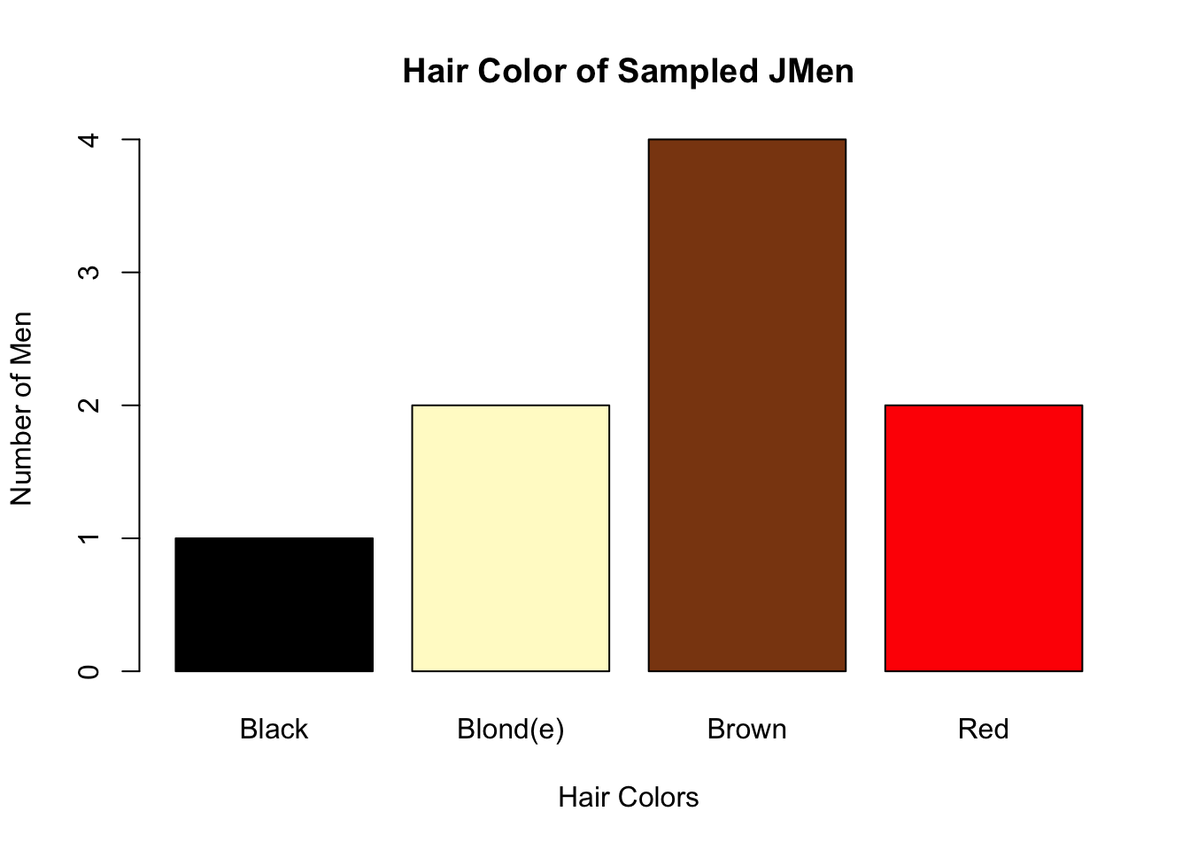
Target Graph
Data Entry
##      Name Age  Eyes  Hair
## 1    John  32  Blue Brown
## 2     Jim  39 Green   Red
## 3   Jamal  48 Brown Blond
## 4   Johan  21  Blue Blond
## 5   Julio  50 Green Brown
## 6  Julian   9 Brown Brown
## 7  Jabril  83  Blue Black
## 8   Jamie  10 Brown   Red
## 9 Joachim  12  Blue Brown
Imitation Graph

I was able to imitate the original graph by creating a new table with the hair colors and then using the barplot tool with that new table. I tried out some new colors to try to find similar matches to the original graph. I used the simpler eye color barplot graph as a guide but added to it since this graph has 4 bars instead of 3. The only thing that might be a little off is that the yellow I have is slightly different and the font size might be slightly different.
Eye_table <- table(jmen$Eyes)

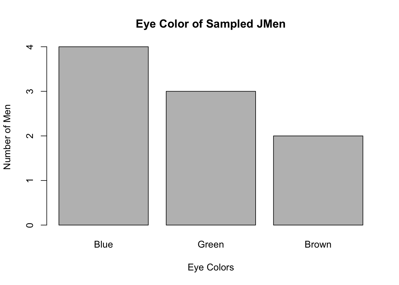
barplot(Eye_table, main = "Eye Color of Sampled JMen", xlab="Eye Colors", ylab="Number of Men", names.arg = c("Blue", "Green", "Brown"))
Eye_table <- table(jmen$Eyes)

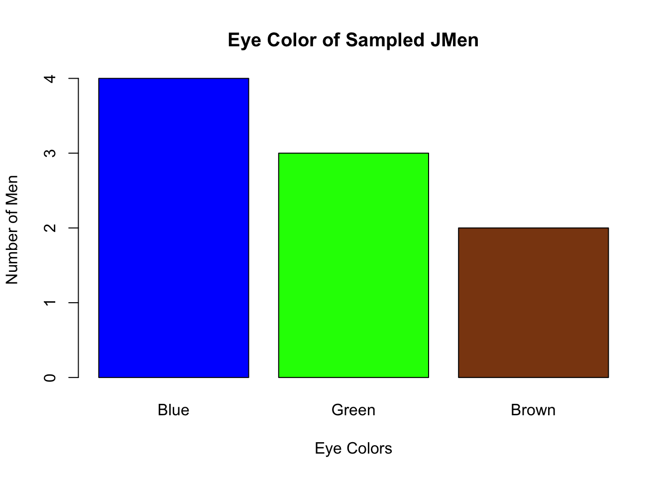
barplot(Eye_table, col = c("blue", "Green", "saddlebrown"), main = "Eye Color of Sampled JMen", xlab="Eye Colors", ylab="Number of Men", names.arg = c("Blue", "Green", "Brown"))
```
```
The goal of the analysis was to create a series of bar charts displaying the relative numbers of men with different hair or eye colors from the data set. The data used was a table with different men and their corresponding age, eye color, and hair color. The graphs were made using the barplot function and the first one was meant to exactly replicate a given image. The data visualizations show that blue eyes and brown eyes were the most popular within the sample.