ge02
Eva Koplow
January 28, 2019
## ── Attaching packages ───────────────────────────────────────────────────────────────── tidyverse 1.2.1 ──## ✔ ggplot2 3.1.0 ✔ purrr 0.3.0
## ✔ tibble 2.0.1 ✔ dplyr 0.8.0.1
## ✔ tidyr 0.8.2 ✔ stringr 1.4.0
## ✔ readr 1.3.1 ✔ forcats 0.4.0## ── Conflicts ──────────────────────────────────────────────────────────────────── tidyverse_conflicts() ──
## ✖ dplyr::filter() masks stats::filter()
## ✖ dplyr::lag() masks stats::lag()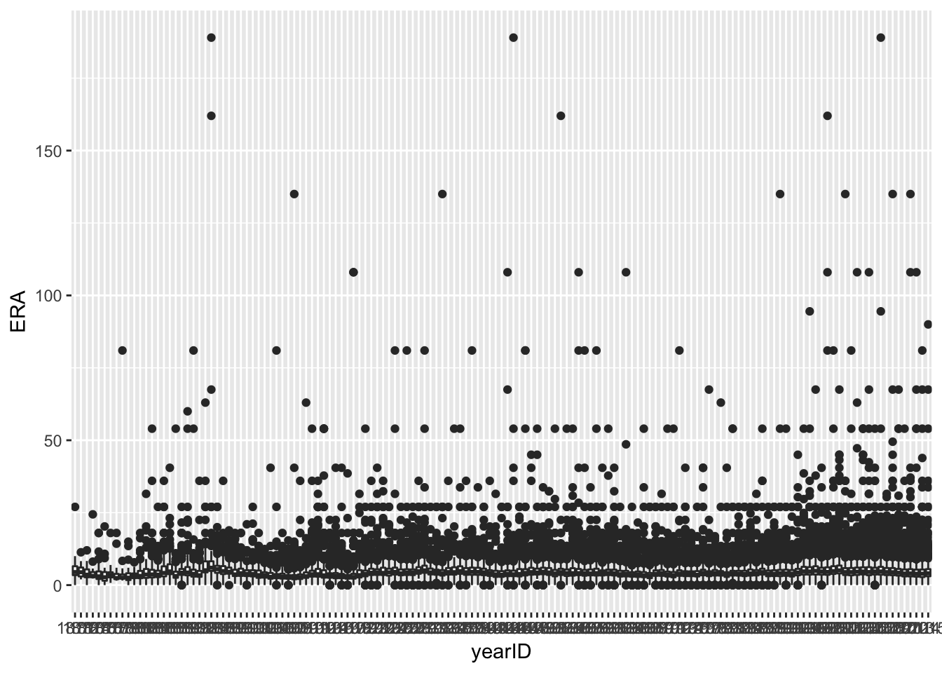
## # A tibble: 145 x 6
##    yearID    Q1 median    Q3   min   max
##    <fct>  <dbl>  <dbl> <dbl> <dbl> <dbl>
##  1 1871    3.44   4.5   6.51  0     27
##  2 1872    3.00   4.45  6.07  1.98  11.3
##  3 1873    2.7    3.6   5.43  0     12
##  4 1874    2.7    3.19  4.5   2.25  24.4
##  5 1875    2.12   3.03  4.73  0     18
##  6 1876    1.52   2.73  4.5   0     20.2
##  7 1877    2.67   3.51  4.42  0.75  18
##  8 1878    2.08   2.46  3.87  1.51  18
##  9 1879    2.26   2.57  3.68  1.57  81
## 10 1880    1.75   2.57  4.08  0     15
## # … with 135 more rows
summary_ERA <- summarize(group_by(pitching_data, yearID), Q1 = quantile(ERA,.25,na.rm=T),median=median(ERA,na.rm=T), Q3 = quantile(ERA,.75,na.rm=T), min=min(ERA,na.rm=T), max=max(ERA,na.rm=T))
summary_ERA
## # A tibble: 145 x 6
## yearID Q1 median Q3 min max
## <fct> <dbl> <dbl> <dbl> <dbl> <dbl>
## 1 1871 3.44 4.5 6.51 0 27
## 2 1872 3.00 4.45 6.07 1.98 11.3
## 3 1873 2.7 3.6 5.43 0 12
## 4 1874 2.7 3.19 4.5 2.25 24.4
## 5 1875 2.12 3.03 4.73 0 18
## 6 1876 1.52 2.73 4.5 0 20.2
## 7 1877 2.67 3.51 4.42 0.75 18
## 8 1878 2.08 2.46 3.87 1.51 18
## 9 1879 2.26 2.57 3.68 1.57 81
## 10 1880 1.75 2.57 4.08 0 15
## # … with 135 more rowssummary_ERA$yearID <- as.numeric(as.character(summary_ERA$yearID))
ggplot(summary_ERA) + geom_line(aes(x=yearID, y=median))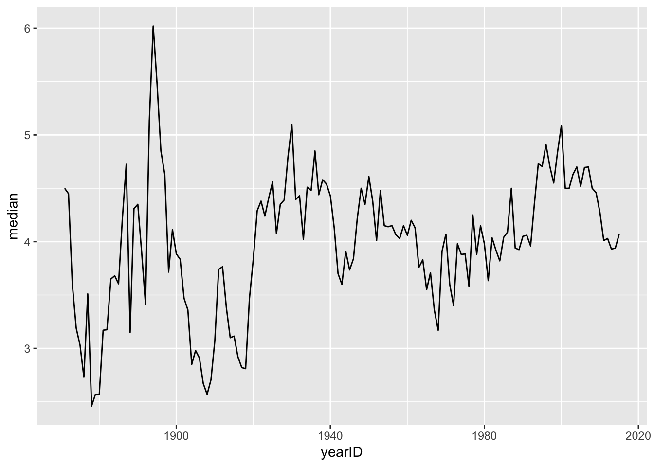
ggplot(summary_ERA)+geom_ribbon(aes(x=yearID, ymin=Q1, ymax=Q3), fill="lightgreen") + geom_line(aes(x=yearID, y=median), color="navy")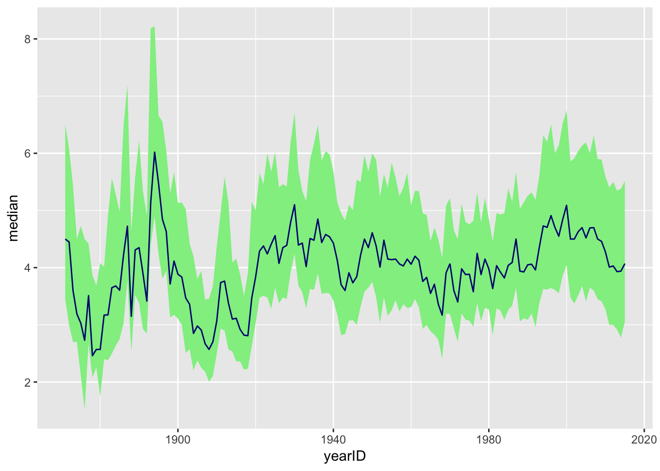
pitching_data$ERA <- as.numeric(pitching_data$ERA)

#filter(pitching_data, G >= 10)
new_pitching_data <- filter(pitching_data, G >= 10)


new_pitching_data$ERA <- as.numeric(new_pitching_data$ERA)

summary_ERA_2 <- summarize(group_by(new_pitching_data, yearID), under3prop= mean(ERA <= 3, na.rm = TRUE), over6prop= mean(ERA >= 6, na.rm = TRUE))
summary_ERA_2
## # A tibble: 145 x 3
## yearID under3prop over6prop
## <fct> <dbl> <dbl>
## 1 1871 0.111 0
## 2 1872 0.333 0.167
## 3 1873 0.545 0
## 4 1874 0.4 0
## 5 1875 0.609 0
## 6 1876 0.786 0
## 7 1877 0.417 0.0833
## 8 1878 0.8 0
## 9 1879 0.867 0
## 10 1880 0.75 0
## # … with 135 more rowssummary_ERA_2$yearID <- as.numeric(as.character(summary_ERA_2$yearID))
ggplot(summary_ERA_2)+geom_line(aes(x=as.numeric(yearID), y=under3prop, color = "3 or under"))+geom_line(aes(x=as.numeric(yearID), y=over6prop, color = "6 or higher")) + scale_color_manual(values = c("3 or under"="darkblue", "6 or higher"="red"), name="ERA") +scale_x_continuous(name="Year")+scale_y_continuous(name = "Proportion")+ ggtitle(label = "Proportion of Pitchers (pitching at least 10 games) \n With Low and HIgh ERAs by Year") +theme_classic()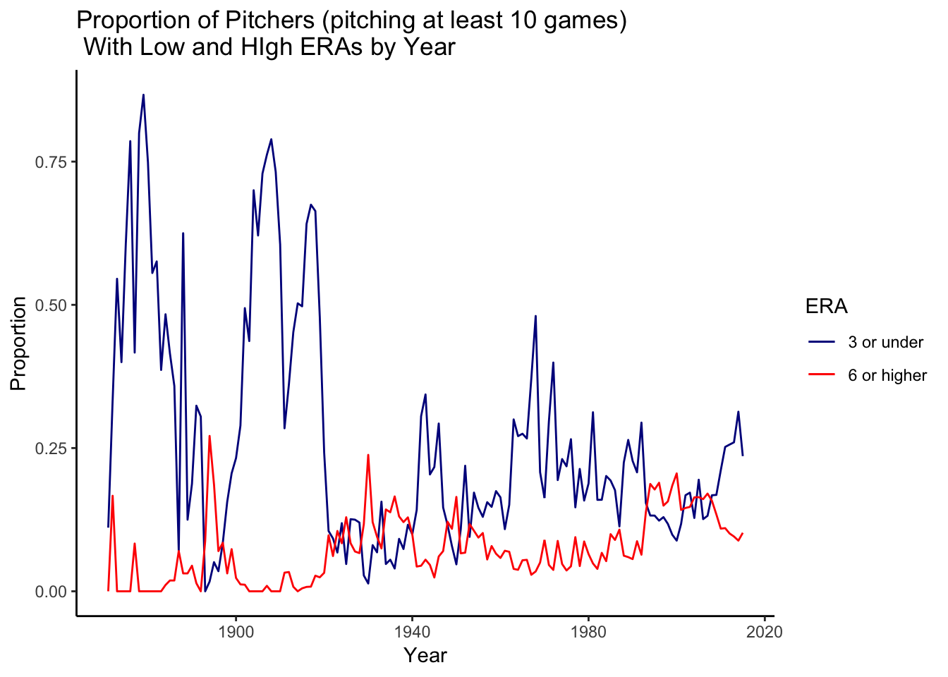
salary_data$yearID <- as.numeric(as.character(salary_data$yearID))
salary_data$playerID <- as.character(salary_data$playerID)
player_data$playerID <- as.character(player_data$playerID)


country_data <- inner_join(salary_data, filter(player_data, !is.na(birthCountry)), by="playerID")

country_data <- mutate(country_data, usa_born =
                      ifelse(birthCountry == "USA","Born in USA", "Born outside of USA"))


summary_salary_country <- summarize(group_by(country_data, yearID, usa_born),
          Q1 = quantile(salary,.25, na.rm = T), median = median(salary, na.rm = T), Q3 = quantile(salary,.75, na.rm=T), min=min(salary, na.rm = T), max=max(salary, na.rm = T))

names(inflation_index)[1] <- "yearID"
summary_salary_left <- left_join(summary_salary_country, inflation_index, by="yearID")
summary_salary_left[summary_salary_left$yearID==2015,"inflation2015"]<-1

summary_salary_left <- mutate(summary_salary_left, median_inflation_adjusted = median*inflation2015, Q1_inflation_adjusted = Q1*inflation2015, Q3_inflation_adjusted = Q3*inflation2015, min_inflation_adjusted = min*inflation2015,max_inflation_adjusted = max*inflation2015)


ggplot(summary_salary_left)+geom_ribbon(aes(x=yearID, ymin=Q1_inflation_adjusted, ymax=Q3_inflation_adjusted,fill=usa_born), alpha=.4)+geom_line(aes(x=yearID, y=median_inflation_adjusted ,color=usa_born), size=1.2)+ scale_y_continuous(labels = scales::dollar)+labs(y="Annual Salary  \n (Adjusted for Inflation)",x="Year",title="Salaries of Middle 50% of Earners in Major League Baseball")+scale_fill_discrete(name="Middle 50% of Earners")+scale_color_discrete(name="median salary")+theme_minimal()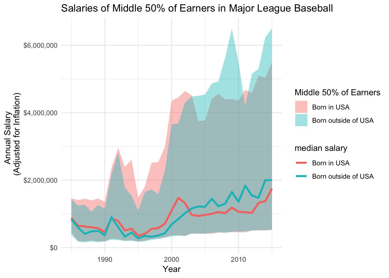
The goal of these graphs was to use different line charts and graphs in order to examine ERAs over the years in Major League Baseball, as well as to examine salaries of players over the years. These graphs were created using “Lahman’s Baseball Database” (http://www.seanlahman.com/baseball-archive/statistics/) and were combined with data on pitching and salaries in order to create the above graphs. Data from the Bureau of Labor Statistics was also used in order to use CPI to adjust the prices. The first graph shows a boxplot for each year showing the distribution of ERAs. The second illustrates the median across the years from the previous graph. One of the next graphs with the green ribbon is illustrates the range between the first and third quartiles of ERA with the blue line depicting the median. The very last graphs how the salaries of the middle 50% of earners in Major League Baseball and the information is sorted by whether they were born in the USA or outside of the USA. The information was adjusted for inflation using CPI. These visualizations can help show how salaries in MLB have been rising over the years and how people born outside of the US have the highest salaries. They also help show how median ERA has been increasing over the years.
Note that the echo = FALSE parameter was added to the code chunk to prevent printing of the R code that generated the plot.